Promotion and optimization
30.01.2012
Developed by online store
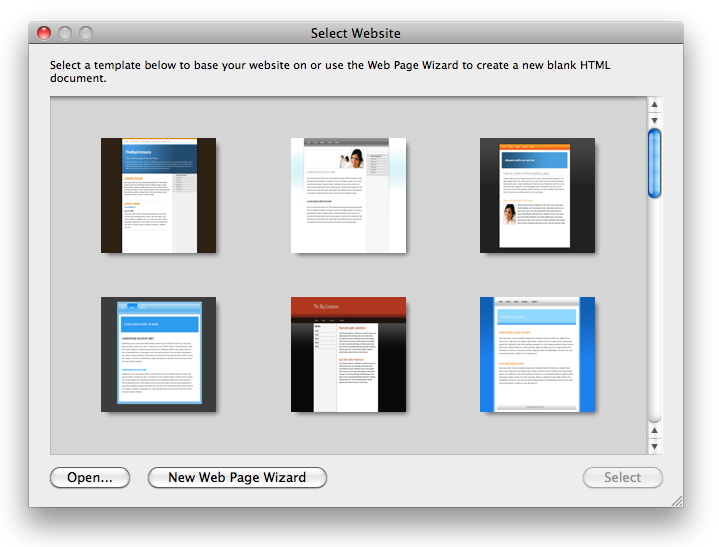
10.07.2015Site Design (Web Design, web design) – This is one of the areas of graphic design. Ale napryamok Tse neobichenoe, and dosit svoeobrazenoe, adzhe site – This is not just a good view or picture, is primarily a Web interface with a variety of different requirements. Create and design demands a great experience for, to do something really high-quality. So, What are the main requirements exposes web design? What is the key to good design? Know it will be useful, as client-customer, and designer-beginner.
Easy to navigate
The site must be located in the menu section, and on each page must be able to return to home page. Menu should be comfortable, noticeable, be at the top, or side, that the user does not have to look for it. If a site-many, and they also have units, you to drop, down. If the site structure is very complex, well make a "map" with explanations.
The texts need to use reference (particularly, if required for more information). All numbers must be allocated a type, different from the font of the text, user to understand, What is it.
Stilіstika site
The entire site should be designed in a similar style, top with about the same kind of. Allowed a home in a little different style. Should be sustained only color, Font. Of course, may be some design, but again, in the furrows of the same style. It is also important to distinguish on the main page (Color, font, Image), and drugoryadne – "Hide", not interfere with the user, but he could if desired, and more.
Size of site
Because of the difference in size monitors, designs websites divided into "rubber" and "hard".
Site Design Gumovy – Site accepts any size screen (the need – stretches or shrinks). This design is quite common now because of this convenience. Although there is a lack of: site design does not have a single type of, because the items will change their position depending on screen size.
Zhorstky design – with a certain fixed width website. Preferably fit under the narrow screen. Ale on Široki – will look a little empty. Although the, of course, this design looks neater "rubber", as a primary form, who thought.
Yaky design krasche – obirati you, Here the whole matter of taste.
Design content
Creating quality website design includes not only all of the above, but also some design content (in, Image, Tables, schemes toscho). Even superdyzaynom you will not save, If your site is nothing interesting, whether it is "interesting" awkwardly executed and you just can not understand it.
And the main: all should have their functions and in harmony.


